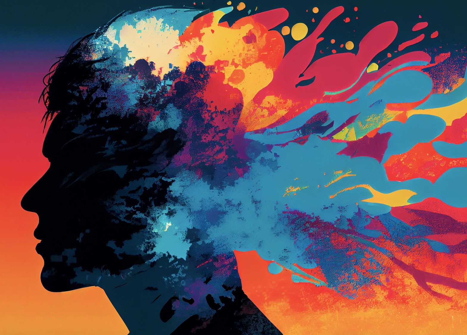
What your choice of colour scheme says about your brand or website?
Colour is one of the most primitive forms of non-verbal communication. Colours attract attention and are often associated with certain emotions and can play a major part in forming decisions. In designing and building your website, apart from the words and content, the most important consideration is your choice of colours. The internet has had a major impact on the use of colour as it is primarily a visual medium and colour is the easiest and most advantageous way to get your message across.
The food industry, for example, has historically indulged in the use of red and yellow, associated with speed and efficiency, whilst Financial Institutions have traditionally used more nationalistic colours to represent security and patriotism. But, as the World becomes a smaller place, Brands are breaking away from what may have been considered ‘the norm’ and instead are using colours more recognisable and acceptable across the ever expanding global marketplace.
Having done our own research, we thought the following might be of interest to you when selecting your colours:
Blue – offers a sense of calmness, trust and responsibility – “honesty and trustworthiness”
Orange – warmth, happiness, rejuvenating, positive outlook – “adventurous and affordable”
Red – the colour of energy, passion and action – “attention getting”
Yellow – uplifting and illuminating, associated with happiness and creativity – “cheerful and fun”
Get your colours wrong for your Brand or Website, and you’ve wasted your chance to make a good first impression.
We have taken a look at how nature effectively uses its fantastic colour palette for a multitude of roles from the lush green of its plants to the black and orange stripes on a tiger. From the first greens of spring to the brilliant oranges, reds and browns of autumn. It uses colour to entice, camouflage and warn.
Statistics show that it takes about 90 seconds for someone to form an opinion and within that time, 70-80% of that opinion is influenced by colour. Limit the number of colours used. Stick to 2 main colours, using shades or tints of these colours to add variation and you can’t go wrong.
We have added a further 4 colours for your pallette.
Green – harmony, renewal and growth – “balancing and reflects nature”
Purple – individual, creative and inventive – “ luxury and royal”
Pink – loving, compassionate and understanding – “youthful and romantic”
Black – strength, authority – “ power and control”
Get your colours wrong for your Brand or Website, and you’ve wasted your chance to make a good first impression. Apart from words and content the most important consideration is your choice of colours and here the 90 second rule definitely applies!

